| Archive/Subscribe | TAPPI.org | Advertise | TAPPI Press Catalog | January 2016 |
PMP Introduces New Branding Initiative
PMP Group (PMP), Poland, a global provider of tissue, paper, and board technologies for the pulp and paper industry, as well as solutions for other heavy industries, has refreshed its branding, implementing a new logo and visual identity. PMP’s image modernization is a response to the significant metamorphosis that the company has gone through within the past couple of years and is an element of PMP’s new strategy for the years 2016-2018.
Through successful execution of capital projects for partners worldwide, PMP has become a more mature and conscientious organization with revenue of EUR 51 million (FY 2015). Today PMP’s products and solutions can be found in 28 countries on six continents, including key references in a diverse array of pulp and paper corporations. PMP has opened new facilities in the U.S., China, and Italy to facilitate service to its customers.
 Over the years, PMP’s strategy has evolved from a "low cost solutions" philosophy (price based competitive advantage) into "optimum cost solutions" (technology based competitive advantage). PMP’s defined "code of values" focused on partnership and an ethical business approach has been the best indication of its endeavors.
Going forward, PMP’s strategic goal is to increase its focus on being a customer driven supplier of investment goods that create opportunities and add value. PMP wants to be perceived as a technological integrator, strong and agile. PMP’s target is to increase its market share by 20% within the next three years, with a specific focus on the Americas.
Recently PMP has embarked on a fundamental evaluation of who they are, what they do, and how they do it. As they have evolved over the past several years from a "best price" to a "best technological solution" philosophy, they have found that in every area of the world they are being referred to simply as "PMP."
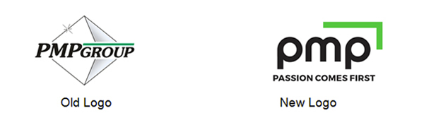
PMP’s new logo was developed after consultation with its clients, partners, and employees and is designed to better correspond with how the world perceives the company. This PMP logo evokes technology and passion. The black and green palette is inspired by more than 160 years of company history. The round elements are associated with the rotating parts of machinery and symbolize continued growth. A green arrow indicates further company development and upward progress, while a modern font underlines the significance of state-of-the-art technology driven by proven solutions.
A new tagline "Passion Comes First" sums up PMP’s vision of its unique approach to company performance and teamwork. PMP believes that the real engine for success is people who drive business forward. This approach appreciates the human side of activity and emotions that shape uniqueness of individuals.
PMP’s new visual identity as well as their new promo campaign "Passion Comes First" underlining PMP’s refreshed and proactive approach to cooperation with its partners around the globe was officially launched on December 14.
|
|